Crafting a website for your business is an energy-intensive task, from the website design and development process to the backend exertions.
Nonetheless, it must be said that business owners shouldn’t be scared away from building their websites due to the complexity of the task. Your website is the cornerstone of your online identity, therefore it needs to be the best version everything your business has to offer.
To help fellow web graphic designers wanting to craft the best website possible for their clients we take a comprehensive look into typography design. This will help you understand which typography fonts to use, and which ones to avoid in your website design and development.
Why Fonts Are Vital For Good Graphic Web Design
While other forms of web-interaction are steadily gaining more prominence in the lives of the average everyday user. It must be said that text-based content still reigns supreme when it comes to traditional web graphic design.

Good typography is an extremely important aspect of the experience a user has on your website. Typographic design that is good will help you in delivering your message across better, thus leading to better user engagement and retention.
Franklin Gothic
Putting Franklin Gothic on this list was a tough but necessary choice to make. Franklin Gothic is a paradoxical font, as its biggest strength is also its greatest weakness.
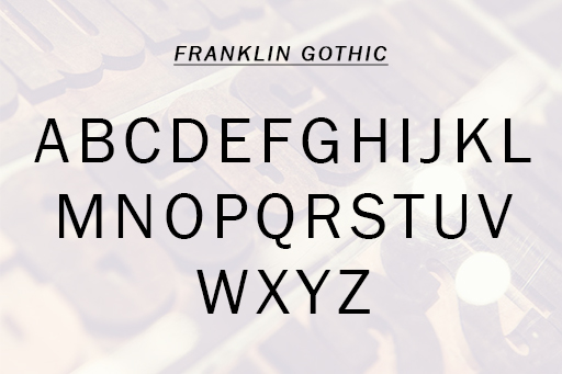
That strength is being extremely popular among graphic designers for crafting messages that must carry a classic look. But due to this, the graphic design services industry has ended up using the font to a state of omnipresence. This has ultimately led to the dilution of the message of Franklin Gothic.
Trajan
Trajan is also an extremely pleasing font to look at, the problem is not in how it looks, rather it is in how it is used. The maximum proliferation of the font has happened in the film industry, especially when it makes it to written content material created for marketing.
What we do not like about this font is its over-dramatic characters. The classically dramatic nature of the font might be appreciated in the film industry. When it comes to the corporate world, where typography’s used for logo design, web application development & design, etc. it doesn’t fit the purpose.
TheSans
TheSans has everything a perfect font should have, from delicate styling to being appropriately spaced. But unfortunately just looking pretty isn’t enough for being part of well-rounded typography fonts.
It is exactly it’s overly intricate styling that makes its different characters stand out just a little too much. For a typographic design to work and enhance the graphic design it’s part of, it must blend in and have cohesion with the rest of the design.
ComicSans
If there is an award for the most vilified font of all times, then it has to go to ComicSans. For some reason, ComicSans has always met with a lot of negative pushback. It must be clarified that we haven’t included ComicSans because we hate it, rather we believe that ComicSans has a role to play in typographic graphic design.
The reason we included ComicSans into this list, was because of its loyal fan base that has started to defy odds and use the font across platforms. Now it’s not the usage of the font that is cringe-worthy, rather it is the whimsical misplaced use of it.
In Conclusion
These were the four fonts you must avoid as a web graphic designer. Now any and all advice must be taken in moderation. Hence we suggest that you use our advice keeping in mind your own design challenges and realities.
As a business owner, if you read this article and find yourself being overwhelmed with the complexity of the task of creating a website. Then you must partner with a capable and skilled graphic designers to propel your business into a digital world.