A website’s success or failure is based on two quintessential things, it’s “wow factor’ and it’s user experience. Good web design is what ties both the ends of the thread thus leading to great user interaction with your product or service.
Thinking that visuals are the only important factor in great web design can’t be further from the truth. Good visuals are only, but a part of great web design, the rest is the perception and functionality that drives the point home.
Understand the golden rule of design, ‘it’s not the reality that matters, only the perception’. When designing your online brand identity, you need to utilize tricks that aid in bolstering your brand’s image on the internet.
So, let’s dive into the matter, and empower you with some niche tricks that aid you in creating an awesome web design.
Prototype before Design
Wireframing is the most crucial step in good web design. Visualizing how the design is going to look like before committing to it is very important to gain insight into your design. It is a must for a designer to understand the vision of the business they are working with.
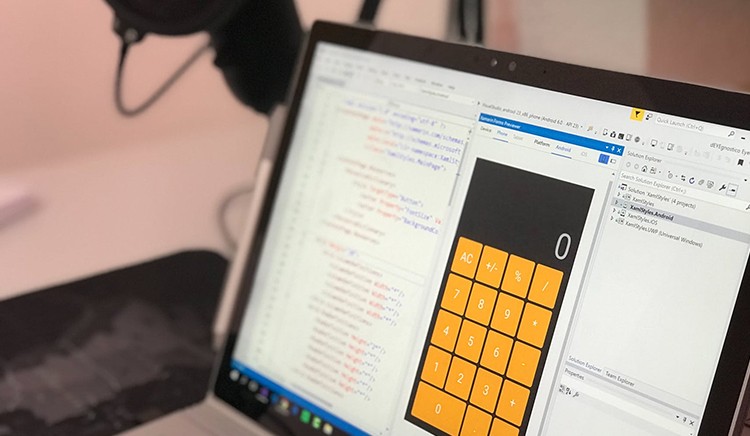
It is also an absolute necessity for businesses to successfully communicate with their design service providers. Failure leads to bad web design and sometimes in negative response from your respective users.
Branding Palette
Human beings are visual creatures who are constantly surrounded by both natural and artificial colors. Hence the evolution of the human mind has been such that it associates different colors with different emotions.
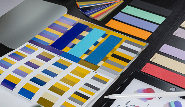
Thus businesses must first lock in a color and branding palette that best expresses their brand identity. If you successfully build a good branding palette, then that can help you invoke particular emotions from your target group.
Simplicity is the Key
Simplistic web design might seem counterintuitive at first but that could not be further from the expectations. Excessive web design elements on a page act as distractors, and may lead to the user getting confused and bounce-off of your website.
A beautifully simplistic graphic design on your website will let your users successfully navigate and help them better absorb the information you want to provide them.
Cohesion
After completing the wireframing process and selecting a suitable color palette for your website, you must look towards cohesion. What this essentially means is that you must focus on seeing that all your design elements must work in harmony and have ‘cohesion’ of your brand message in them.

You can also take this idea a step further and use unified design philosophies across multiple platforms to spread a robust brand image to both online and offline crowds of prospective customers/users.
Typography and its Use
Throughout the years, beginning from the age of typewriters to the consequent creation of the PC, typing has become something more than just words. It has transformed into the foundation of visual communication.
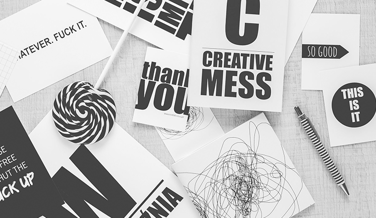
This is the reason typography has turned into an imaginative outlet for some, brands looking to effectively impart their message and brand personality. Consequently making typography into one of the inherent features of UI structure.
Another key aspect that contributes to typography’s importance is its utility as an effective tool for SEO. Being able to market your product or service while making it look and feel beautiful is shared by very few aspects of web design.
Mobile Must
Mobile phones have overtaken desktops in terms of user traffic generated on the internet. It would be a grave mistake for designers if their websites and graphic design are not mobile-friendly.
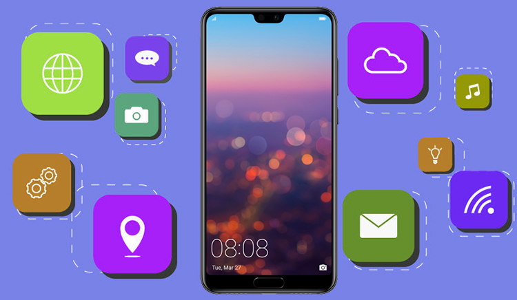
As a business, you must make sure to integrate the 16:9 aspect ratio of the smartphone screen into your web design. By creating an out of the box mobile-friendly web design, you reduce the cost of development.
What I think
By maintaining these standards of good web structure, you can build up an aesthetically functional site. With these little tips and tricks you can build a web design that is filled with that ‘Wow factor’. When it comes to mature graphic web design, the name of the game is ‘keep it simple, keep it cool’. 42Works has creative and professional designers who would love to help you, reach out to us!
Author Bio:
Aamiya Mahajan is a Business Development Manager at 42Works. She interacts with prospect clients worldwide and is at the helm of building the company’s brand value. In her free time, she likes to pen her thoughts on the market trends. You can connect with her on LinkedIn or Facebook


