It might be hard for you to learn that the landing page you spent so much of your time carefully putting together, actually SUCKS! Nopes! Not the time to go sulk in a corner, you need to accept the truth.
Say it out loud, “Yes, my landing page wasn’t that great”. Why do you need to do this? Because ACCEPTANCE is the first step towards the recovery of your conversion rate!
And the second step involves you MAKING AMENDS, and here’s how you can do it: Just carefully analyse these following 5 landing pages, figure out what your touchdown lacked and start over.
#1. Cheezburger
Cheezburgerrrrrrrr!
Don’t we all love one? We bet you will fall in love with this Cheezburger landing page as well!
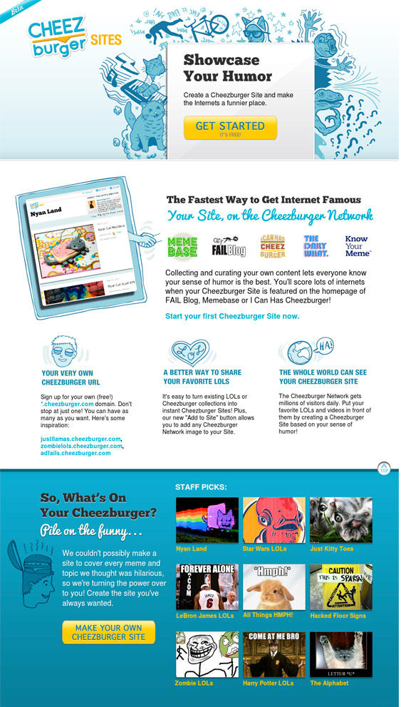
Firstly, just like a nice juicy burger, the page is broken down into vertical layers that make it easy to digest and browse. The sectional headlines are simple and inviting.
The big steal here is the content and the repeated CTAs. While the content explains in simple terms that you can create a free site, the recurring CTAs keep enticing you to sign up and aid conversions.
#2. Ben the bodyguard
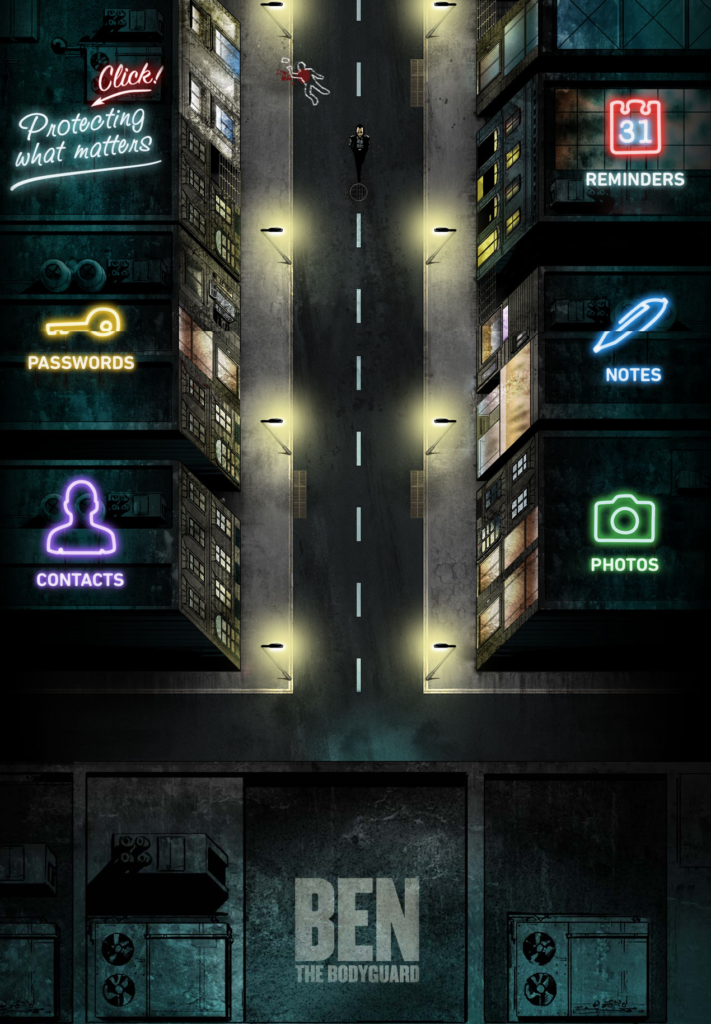
It’s not often that a site can feature so little copy on their landing page without sacrificing a user’s understanding of the service. But Ben the Bodyguard proves to be an exception and an EXCELLENT one!
The character’s analogy and name aptly embody the brand’s mission and tone so well, that all you need are a few keywords to understand the site’s purpose and connect with it.
The key takeaway from this site is Ben himself : the clear; concise; badass brand manifest.
#3. Giftrocket
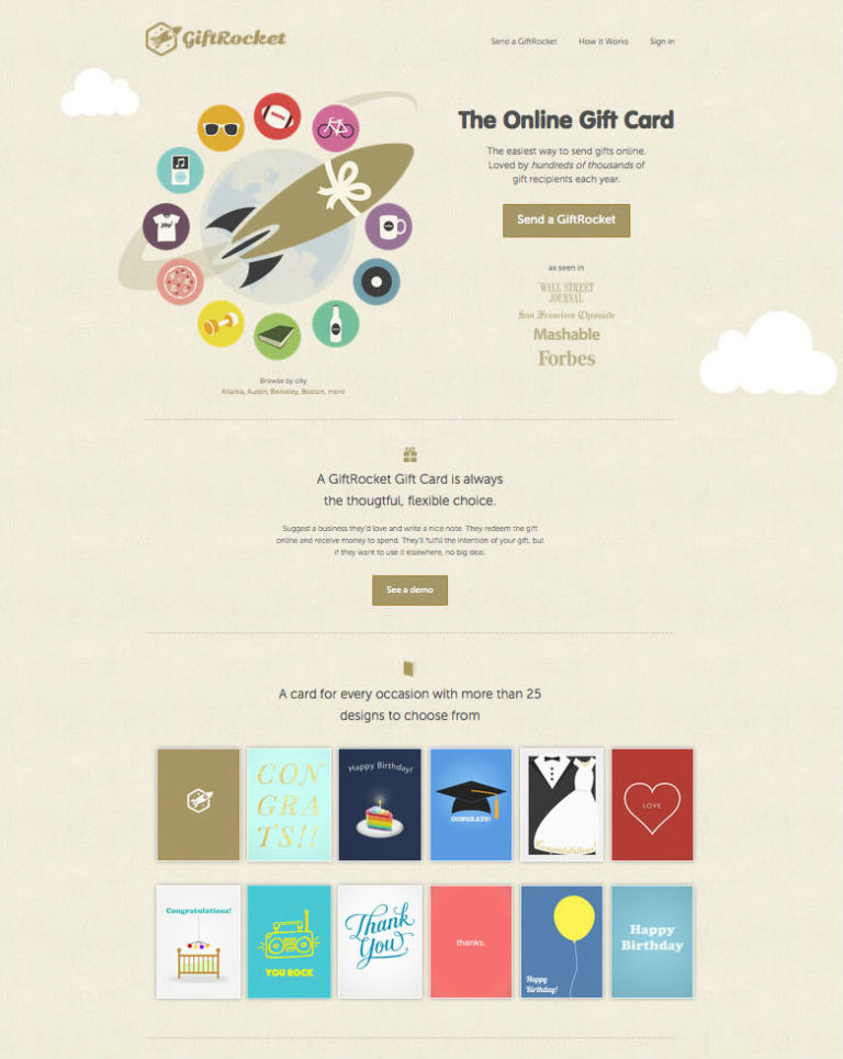
A great example of how a simple “header + bullet-points + call-to-action” can be a conversion machine is GiftRocket.
The site’s beautifully designed landing page features an illustrated ‘hero’ image, surrounded by icons of all the different products and services that are available for purchase.
But that single, prominent ‘Send a GiftRocket’ button is a surefire purloin worthy. The CTA is the “golden” button that draws the attention of the visitor and compels them to click.
#4. Squarespace
Squarespace provides high-quality website templates on a subscription basis and clearly, knows that users respond to different touchpoints.
The site presents several landing page templates showcasing different aspects – a full-screen ‘hero’ image, a large header in the center, and the CTA – ‘Get Started‘, placed directly underneath. The whole landing page urges you to just pick a template and get started.
But the one thing you can total ram raid here is Squarespace’s modern yet elegant theme. Its groundbreaking designs have not only manage to smash stereotypes but has also emerged as a conversion monster.
#5. Monotype
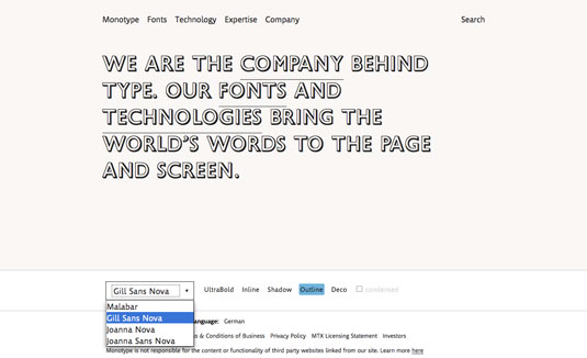
“We are the company behind type”
The confident statement goes hand-in-hand with the brand’s landing page and its understated yet modish design.
Apt for a company that works in type, the entirely text-based landing page comes with a clever twist – letting the visitors play with the mission statement to give them a taste of what Monotype actually do.
And the key ‘type’away is a no-brainer : Simple is the new smart!
Ready for a Flock of Leads?
So there you have it: your top 5 high-quality landing pages that convert like crazy.
Some entice, some educate, and some threaten to kick the wind out of your competitors. Different approaches, to be sure, but all effective and all inspiring.
If you are still finding it arduous, take a look around 42Works’ toil. We are always here to assist you.