Not every visual story has to be interactive! Repeat it after us: Your visual story does not have to be interactive to be effective!
Your story, however, must be engaging.
Engaging visual storytelling is a powerful approach that can, when done right, compel users to convert more effectively than any other element of optimization. But that doesn’t imply your site to be filled with crazy visual callouts or is way too minimalistic.
It’s all about making your story as apt as it needs to be: no more, no less. If your story can be told with a single image, don’t use twenty. But if it does require twenty visuals to work well, then don’t try to sum it up in ten.
In this article, we’ll explain you the 3 approaches for creating an interactive story.
#1. Spin your story around your users
One of the easiest ways to directly engross your user is to make them a character. They immediately become invested in what you’re telling them when they get to see themselves in a new role.
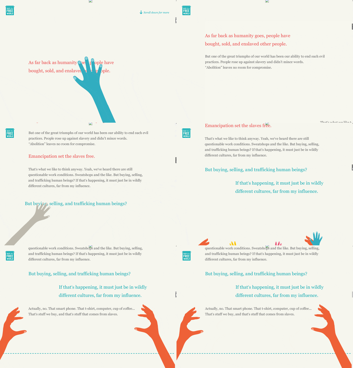
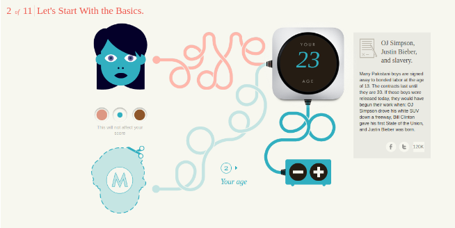
The Slavery Footprint can perfectly teach you how to engage your customers with your design.

But what makes it more compelling is the way the website uses a guided questionnaire to make their users feel at home. They make the information they’re presenting pivot around the user which makes it directly about them, rather than just some general, faceless person.

#2. Sunny side up: Give your site an “Easter Egg” effect
Who doesn’t love Easter Egg?
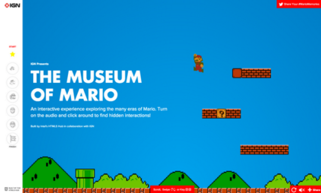
The joy of discoverability can be one of the most memorable experiences for users. One great example of a website using this tactic well is The Museum of Mario. The site showcases the evolution of the Super Mario and related video games.

Different areas on different screens are designed to perform a variety of actions, mimicking gameplay and revealing information about characters and games. But the one thing to notice is that The Museum of Mario still gives you an option to experience the whole history of the game without ever using the hidden click feature.
Why? Because when designing for a better user experience, it all comes down to the USER.
Before you design anything, know your users inside and out. Be sure that they actually understand and enjoy this kind of playful interaction. Prioritize the tasks. Actions that are critical for user goals must be explicitly visible, while those that are sporadic can afford to be less visible or even hidden.
#3. Make your website respond
Adding visuals that respond to user actions is another way to make your design speak for itself. From simple animation to static gifs, make these visual reactions triggered by clicking, scrolling or a more complex action like a form submission.
Take the Babel app for one great example. As you scroll down, Babel – the title cat character seemingly falls from the sky, tumbling on the way down. Stop scrolling, and the cat rights itself, holding onto an umbrella.
A simple yet interesting way to keep you intrigued, isn’t it?
Conclusion
Engaging design isn’t an ornamental branch of web design – It is the core that allows the users to become part of your story, which makes them more of a participant than a passive observer.
Make your visual story as simple or complex as it needs to be to get the job done. Don’t add interactive elements just for the sake of adding them and consider carefully those that you do add to ensure they add value to the end user, rather than just being there to “impress”.
For more tips on designing better websites through storytelling, stay tuned to the 42Works’ blog.


