A website is known to be the best marketing tool for a business. How? By playing the role of a salesperson 24/7 as well as being the core part of a business’s marketing efforts. A business’s website or app has a long-lasting and powerful impact on a customer’s mind. The impact could be either bad or good depending upon various factors.
Your product, be it a website, mobile app, or anything similar depends upon user experience. Speaking of which, many UX designers have their concepts wrong about a product’s design and how it leaves an impact on users. Therefore, your UX design needs to be appropriate as per your target audience for it to grow and succeed otherwise, the outcome would be the opposite.
On the other side, digital trends are advancing day by day which makes a website old-fashioned. Re-designing your website can be feasible sometimes but not always. Hence, we have integrated some of the best possible ways to help you improve your website’s user experience.
Meaning of UX Design
User Experience Design (UX Design) refers to the feelings of users that they get while using a product, application, system, or service. It is a broad term that can cover anything from how well the user can navigate the product, how easy it is to access, how relevant the content displayed is, and so on. The main aim of UX design is to help you make a website or application which is easy to use and not chaotic for your target audience.
Best Ways to Improve your Website’s User Experience
Conduct a Research on your End Users
When working on the user interface for any product, the first and foremost question one needs to answer is for whom are you making the product? In addition, you need to also first understand who are going to be the end-users of your product rather than worrying about how the product should look like.
Your target audience or end-users are the ones to lead you through the designing process of the product.

To better understand who your target audience should be, seek answers for the following –
- What demographic features are you targeting – Women, men, students, parents, or maybe professionals?
- What interests are you targeting – Gamers, volunteers, fashionistas, foodies, musicians, travelers, etc.?
- What products, apps, or services are already being used by your target audience?
- How do these users respond to already using products, and what can you do better?
Getting the right answers to the above questions will give you a head start for designing your product.
Keep it Simple
Simplicity, when designing a website or an app, means having a clean layout. Your graphics must be attractive yet serve a purpose to the users. It doesn’t matter if your website has 10 pages or 60 pages, each of them should serve a single purpose.
Remember, if your website turns out to be confusing to users, do not expect them to hang around for a long time. This is the point where you will start losing your potential users.
Whitespace is your Best Friend
If one design principle has taken over the UI/UX world in the recent years is the use of whitespace, and hence one must make sure to pay a lot of attention towards the same. This is one of the quickest and easiest ways one can use to make their website look polished and clean.
However, this does not mean that you have to use whitespace all the time and everywhere in your designs, efficiently using it between the important elements of your website should work pretty well, bringing simplicity and neatness to your web pages.

Some of the points that will help you to take advantage of whitespace to its best potential would be:
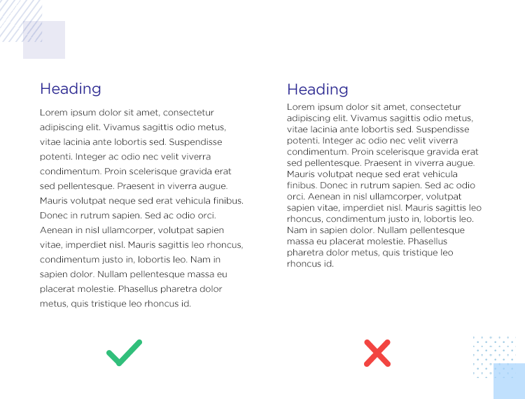
- Increase the amount of line spacing between the text, making the text more readable to the users.

- Create a visual hierarchy to help users easily process the information on the page.
- Insert images at the top or bottom of the text paragraphs and not in between the text lines.
Customer Feedback is the Key to all Problems
The best way you can find out if your website is easy to use or not is through feedback from users. Users are your way through a successful product design hence, their feedback is equally important.
After the launch of your product (website or an app), you must keep a check on your users and how they feel about your product. Ask them timely questions on the experience they are having, the changes that are needed to be done, etc. Listening to what your target customers have to say can help you optimize your product to greater levels.
Page Speed & Performance
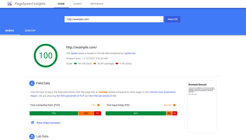
Another important factor that can help you improve your website’s UX is your website’s loading page speed. For example, if your website is taking longer than 3 seconds to load, your bounce rate is likely to increase over 100% (resulting in more than half of your users exiting from your website or app). You can make use of Google’s Core Web Vitals report to fix the problem of poor user experience on your website, about which you can read about here in detail.

Further, you can also make use of PageSpeed tools (or these top 15 website performance and speed testing tools of 2022) to not only analyze and optimize your website but also to enhance your site’s overall speed and performance and ensure that the users are getting what they came for in lesser time. Do not make your users wait forever to access your website.
Pay Attention to Your Content
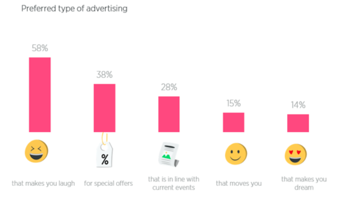
It’s often said CONTENT is KING, and we couldn’t agree more with it. If your content is poor, your marketing efforts will go in vain irrespective of how effective it is. Use simple language that your users can easily connect with and relate to, be user-oriented, and you may use a sense of humor in between. Afterall, what’s better than breaking the ice with a joke?

Here’s a quick guide to know when and where to use humor in your content.
Well-written content and attractive graphics make through users’ heart and therefore, makes their experience more valuable. No user will ever be drawn to an interface showing difficult and weird language or poor-quality graphics.
Create a Visually Distinct Page Layout
A yet another important factor in improving your website’s user experience is by creating visually distinct pages which enable users to engage more with the content. To ensure your users have the best possible experience then, provide them with easier ways to look for what they came for in the first place.
You can use the following tips to make your designing process better:
- “It’s all in the details.” Therefore, ensure you’ve worked enough on the details of the visuals. For instance, if you are uploading an article, give it a catchy title along with headings and sub-headings for users to relate better.
- Call-to-action buttons must stand out on your website with a clear motive.
- The ‘search’ field must also be designed distinctively.
Further, when using colors make sure:
- All the background colors are muted.
- Use blue color for highlighting links.
- Use red color to highlight essential details.
- Call to action buttons must have contrasting colors to stand out from the rest.
User Flow: Why it’s Important?

Yet another easiest way for users to reach their intended goals and tasks is User flow, which is a series of actions taken by users to achieve particular goals. User flows provide a bird’s-eye view of the product to the users. It acts like a GPS, that helps us deduce what the user is trying to achieve with the feature he is using and how.

In designing a user flow, you may consider the following:
- Who is the user of your product?
- What are their goals?
- What are the steps the user needs to take to achieve those goals?
On a parting note, a user flow is that element of the design process that is essential and cannot be overlooked.
Responsive and Mobile-Friendly Website
Ever since the starting of the last decade, mobile-friendly websites have proved to be one of the best ways to boost your sales and conversions Users will interact and engage better with your brand across various devices, provided your website is mobile-friendly. This will further increase accessibility – a key to create long-term loyalty and customer retention. Therefore, it is crucial to invest in a responsive yet mobile-freindly website early on.
Conduct an UX Audit
How one can figure out what requires optimization in their website? With the help of a UX audit, which can also be considered as a health check. UX audit can be conducted at any stage of your product’s life cycle to find out current performance issues and areas that need improvement.
Undoubtedly, UX audit is the most effective way to help you assess existing user flows, detect problems, distractions, or bottlenecks preventing users from taking specific actions. Besides, you will also gain insights on whether your functionality is well-perceived by users or not.
Conclusion

As business owners, you must incorporate interfaces and interactions that are intuitive and not confusing. Work on improving users’ experience by using content and structure based on your target audience. The aforesaid UX design tips are sure to help you build a design that fits best with your target audience, therefore making it useful for both – you and your users to interact as well as navigate through the website or app.
If you need any help with a UI/UX audit for your website or application, or, if you are looking to hire a professional team to work on the UI/UX of your new product, don’t forget to check out the UI/UX services offered by 42Works. For queries or a quote request, visit https://42works.net/contact or email us at contact@42works.net.


