With 2019 marks the beginning of the end for the last decade. The world has changed quite a lot in the last decade, especially the internet. In the past ten years, we saw the rise of Smartphones, Artificial Intelligence, Augmented Reality, Virtual Reality, IoT, etc. As the world of internet technologies has moved fast, so has the world of web design.
In recent years, web design trends have moved away from traditional girds and stock images. Now dynamic images, bold color pallets, asymmetrical patterns, etc. have become the hallmarks of attractive web design.
As web technologies have evolved they have also fuelled the website to become smarter, with subtle user interactions and machine learning. Here are the top 10 web design trends that all graphic design services providers must use to perfectly combine aesthetics and emerging new tech.
Minimalism
Minimalism is one of the most classic web design trends that are truly timeless. It is the go-to choice for many aesthetic loving web designers.
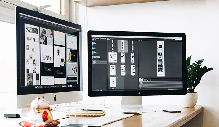
The small number of working elements on the website helps in concentrating user’s attention at places where you want them to look. It is one of the staple trend choices for graphic design services providers who follow the ‘show, don’t tell’ design philosophy.
Fade in and out scrolling, contrasting colors and useful positioning of the content using whitespace is what makes minimalist websites stand out of the crowd. Clear and loud typographic is also a must to drive home the point.
Thumbs First
Smartphones have already overtaken computers in terms of web traffic. This makes it imperative for graphic design services providers to factor in thumb-first web design philosophies.
It is a must for new websites to be mobile friendly with content that can be viewed perfectly in the 16:9 ratio of modern smartphone screens. It is also important to add thumb-centric navigation menus and overall content placement suited for single-handed use.
Micro-Interactions
Users on the internet love surprises and micro-interactions are the best to give them that. Micro-interactions add another layer of humanity to the seemingly cold and inhumane internet.
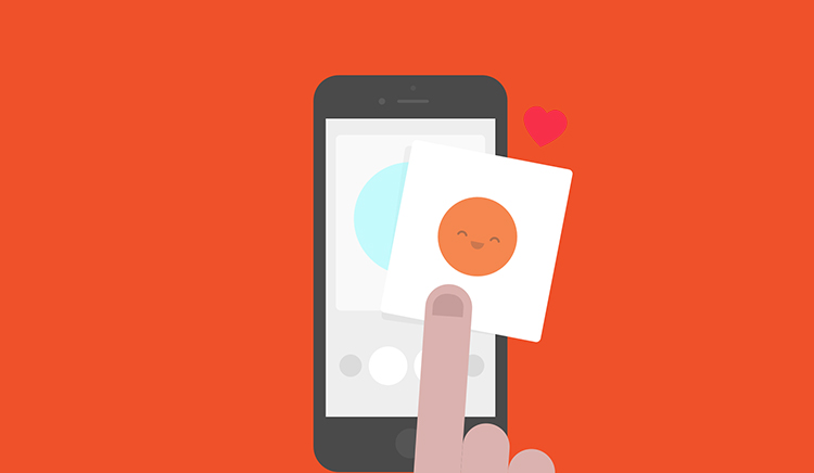
Every time a user executes a small action, they receive a subtle little reaction. For example, when you send a text message on your online messenger application, it beeps when the message is sent this happens to be a micro-interaction.
More and more web pages have started to use this tactic to surprise new and old users alike. Beeps, chimes, hover animations, etc. all make the web-surfing experience more fun and interactive. These interactions lead your users to be highly susceptible to strategically placed ‘call to action’ buttons.
Neo-Glitch
Neo-Glitch is a modern rendition of an old design trend. As smart devices have become practically omnipresent in our lives we as human beings constantly run into the fear of a machine takeover.
Thus the dystopian possibility of the future is extremely attractive to users to see and interact with. The purposefully disorienting and psychedelic look is what you should be looking for in good Neo-Glitch art.
Evolution of Chatbots
Chatbots have been on the web for quite some time now, but they have finally started to gain traction in 2019. This traction can be attributed to the advances made in AI and machine learning which has made them smarter.
Chatbots are slowing becoming staples of website design with being available in different levels of customizations. The use of warm and bright colors make chatbots seem more inviting and humane, thus driving up the engagement of your website.
Serifs
The bold quality of serifs is what makes them attractive to so many brands looking to stand out of the crowd. While it is true that Sans with its ease of readability is still a top contender for website typography. It must not be forgotten that serifs are designed to be decorative and emphatic thus making them suitable for brands looking to make a statement.
Serifs do wonders when combined with minimalistic web designs and contrasting color pallets. Graphic design services providers should understand the importance of typography in UX and how to enhance it.
More Video
Video content is as old as the internet itself, thus it is nothing new to use them in web design. Video content not only gives your website variety but also caters to the vast majority of people visiting your website, who wouldn’t have time to read through the entirety of the page.
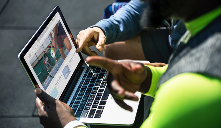
New updates to the Google search algorithm now put video results above standard web pages. If you want to maintain or reach 1st Google Page ranking using video to get there is a must.
Organic Shapes
Symmetrical grid designs have traditional dominated modern web design, but things are starting to change. In 2019 trends indicate there is a clear change in the mood of the user, who are moving away from share contrasting shapes to more natural organic ones.
Shapes with curvature and rounded edges are what seem to be attracting users today. Organic shapes come with a familiar feeling which makes them more welcoming and thus leads to more interaction on the site. The goal for web graphic design services providers should be to make their websites feel more human and alive.
Black & White
Color is by far one of the most important aspects of great web design. Color helps bring a vibe and mood to your website that rubs off on your users. It also plays a crucial role in unifying your brand identity across multiple platforms both online and offline.

Graphic design services providers need to play with the color pallet to grab the attention of the user. One way of successfully achieving a high attention rate is by using contrasting color pallets.
The usage of Black and White might seem counterintuitive at first, but the more you think about it, the more sense it starts to make. Two of the most abundant colors in nature, black and white have been with humanity since its dawn, thus having an evolutionary impact. Black can be used to create mysterious, eerie or even scary designs, while white can be used to create a neutral and welcoming UX. A combination of both can be a truly three-dimensional experience for the users.
Inclusion
The internet is the great equalizer of our time. This makes it imperative for web designers to be perceptive of the new changes in the user demographics on the web. With internet connectivity reaching all parts of the globe, it is important now more than ever to use inclusive graphic design.
This inclusion goes a long way to make your users feel more connected to your brand identity, and thus feel more strongly about it.
The world isn’t perfect when it comes to accommodating people from different walks of life, but graphic design services providers can be the ones leading the change.
Our Take
The internet has changed a lot since its inception. It is the need of the hour for new and old businesses and brands alike to understand this and make changes to their online identity. Failure to make such changes are only going to isolate such brands and businesses into a group small group of under-achievers in the online world.

