We are living in a digital age where mobile phones have become our best friends. Thanks to technology and developments we have shifted from desktops to mobiles now. Everything is accessible from the small screen of our mobile phones.
In 2020, Google announced that mobile-first indexing will be enabled for all websites. It means that Google will use the content on the mobile version of the website for ranking and indexing.
Mobile devices have a huge impact on website traffic, so all website owners are focusing more on making their website mobile-friendly.
Let’s start with understanding what a mobile-friendly website is.
What Is A Responsive/ Mobile-Friendly Website?
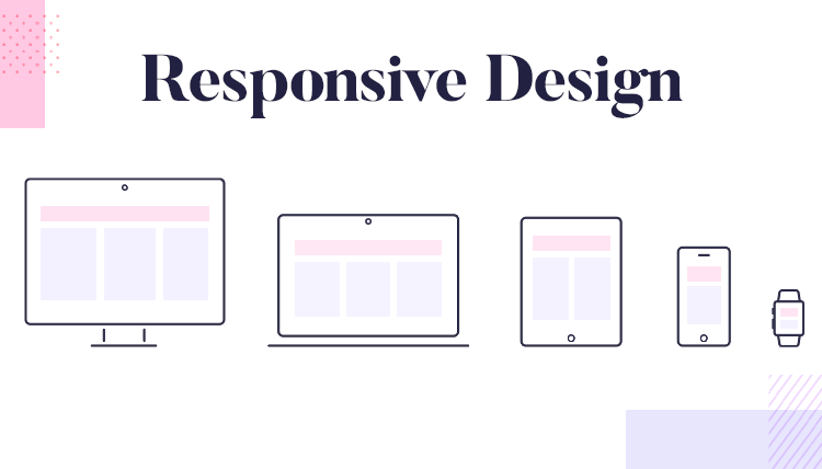
A responsive website means a website that is specially modified to fit on the small screen of mobile devices. These websites are designed in such a way that they have better functionality on mobile & other devices as well.
Why Do You Need A Mobile-Friendly Website?
Most businesses these days are focusing on making their websites mobile-friendly which is why we have created a list for you containing all the important points as to why you should make your website mobile-friendly.
Must For Ranking On Google
For most businesses, most of the traffic comes from mobile phones. And one of Google’s key metrics for higher ranking is checking mobile page speed. With changes in the Google algorithm, websites that are optimized for mobile devices will rank better. Users are likely to leave the website if it is not optimized for mobile, leading to a bad user experience.
To ensure that Googlebot can render your content use:
- The same meta robots tags on the mobile and desktop site.
- Don’t lazy-load primary content upon user interaction.
- Let Google crawl your resources.
Content Is Sharable
Content on mobile-friendly websites is more shareable, which means that it’s much easier for users to share website links on social networks and text messages, which saves a lot of time. You will have a wider reach as more and more people see your content.
To make your content easy to share, include bulleted lists, numbered entries, images, and video content. Video content is the easiest type of content to share on different platforms. Indicate your audience to share the content pages by using CTAs and callouts.
Attract More Audience
Since more and more people are using mobile phones to access information on the web, you must make sure that they have a good and fulfilling experience. If they find information that is relevant to them they will keep coming back.

If you want your customers to keep coming back to your website then make sure that you update the content periodically and write relevant content. To entice new customers your business website must have simple features and easy-to-use navigation. Check that there are no broken links because that will drive the customers away rather than attracting them.
Great For Brand Identity
Websites are a way of communicating with your customers which helps build your brand identity in the market. A mobile-friendly website is very important to build a brand-customer relationship.
With an increasing number of mobile users, mobile internet consumption is huge. It is seen that users tend to stay more active on mobile devices than on desktops which is very effective to spread brand awareness. An impressive brand image will get you higher ROI and will contribute to the growth of your business.
Effective Communication With Users
Just making a mobile-friendly website is not enough. You also need your communications to be mobile-friendly and for that, you must make a mobile-friendly email address for your website.
To ensure a good user experience you must ensure a responsive design for emails that fit on the small screen of your mobile. Make sure to keep the subject line length short, Use pre-header text, Include CTAs, etc.
What Makes A Website Mobile-Friendly?
In simple words, to build a mobile website you need to reorganize the contents of your regular website so that it’s easily accessible on mobile devices. Let’s find out how to do that.
Keep A Check On Website Speed. Google considers mobile page speed a very serious metric for ranking on SERPs. Nobody will wait around if your load speed is slow, and the visitors will go to other websites. Google offers a free tool, PageSpeed Insights that helps you check your page speed and also provides information about field data and lab data.
Some steps you can take to improve your site speed are:
- Minify CSS, JavaScript and HTML files.
- Reduce the number of redirects.
- Improve server response time.
- Optimize your images.
- Use background colors or gradients instead of background images.
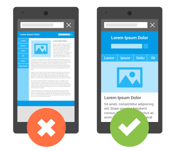
Keep Web Design Simple.
You should stick to a clean and minimal design. Make sure that the design is not looking very cramped with too many files or features. Simpler the design, the loading speed will be fast.
To maintain a clean website design:
- Include abundant amounts of white space.
- Follow a simple layout.
- Do not use more than 3 colors at once.
- Avoid using extra buttons.
Avoid Using Flash. Websites use flash to incorporate animations & interactive content into their websites. These days, web designers and developers understand that using flash will affect website performance, so it must be avoided. But if you have a website that was made some time ago, then you should make the required changes.
Use of flash should be avoided on websites because:
- It is considered a security liability.
- Vulnerable to online threats like viruses and hackers.
- It cannot handle complicated animations and videos.
Limit Text Blocking Ads and Pop-Ups.

You know when you’re trying to read something on a small screen and some ad pops up blocking that text? It can get very disturbing for the customers visiting your website. If you cannot completely ditch them then you must disable them for mobile users, or ensure that a pop-up appears only when the customer has scrolled down to the bottom, not when the page has just been loaded.
Is Your Website Mobile-Friendly?
As of May 2021, 55.31% of web traffic from all over the world comes from mobile. This number itself emphasizes how important it is to have a mobile-friendly website to attract more customers. Rather, you might be putting your business at risk by not making your website mobile-friendly.
Some ways that we have discussed in this blog to make your website mobile-friendly are: keep the web design simple, use large font sizes so that the users don’t have to zoom in and squint much, etc.
42Works understands the importance of a mobile-friendly website which is why we’re here to change your website accordingly and help you adapt the practices of a mobile website to enhance your brand identity and also maintain your customer base. Get in touch today for more details!