Designing a user interface (UI) and user experience (UX) that is both visually appealing and user-friendly can be a challenging task. With so many elements to consider, it’s easy for designers to overlook some of the basic tips and tricks that can make all the difference in creating a successful design. From typography to color schemes, small details can have a big impact on the overall user experience.
In this blog post, we’ll be exploring some of the basic UI and UX tips and tricks that designers often tend to miss and forget. Whether you’re a seasoned designer looking to refresh your skills or a newcomer to the field, these tips will help you create designs that are not only visually stunning but also intuitive and engaging for users. So, let’s dive in and explore some of the fundamental principles of UI and UX design that you may have overlooked.
Keep the CTA on the Right
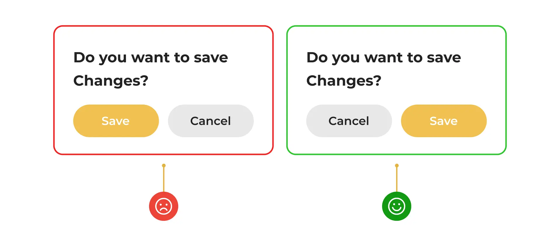
Placing the call-to-action (CTA) button on the right side of the page or screen is one of the most basic UI tips that one may take for granted. This placement is based on the reading pattern of most languages, which is left to right. However, there is another reason why placing the CTA on the right side is recommended.
When the primary action is on the left, it can cause the human mind to take time to absorb it. This is because the left side of the brain is responsible for logical and analytical thinking, while the right side is responsible for creativity and intuition. When the primary action is on the left, it requires the left side of the brain to process it, which can take more time and cognitive effort.
Placing the CTA on the right side of the page or screen can help reduce cognitive load and make it easier for users to take action. By placing the CTA on the right, it is more likely to catch the user’s attention and prompt them to take action without causing cognitive strain.
However, it is important to note that the placement of the CTA may vary depending on the design and layout of the page. The CTA should be prominent and easy to find, and its placement should be tested and optimized based on user behavior and data. Overall, placing the CTA on the right side is a design principle that can help improve the user experience and increase the effectiveness of the CTA.
Handle the White Text
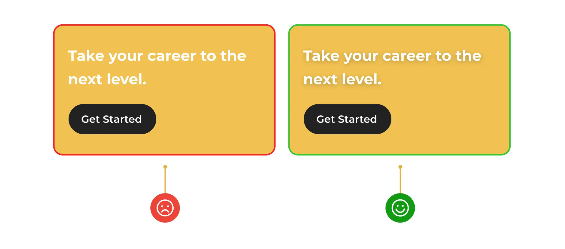
Using white text on bright backgrounds can be visually appealing, but it can also be challenging to read. This is because the white text can blend into the background and become difficult to distinguish, causing eye strain and making it hard to understand the message. However, in some cases, white text may be necessary to achieve a particular design aesthetic or to meet brand guidelines.
To make white text more legible on bright backgrounds, you can add a subtle shadow. This shadow will create a contrast between the white text and the background, making it easier to read. The shadow should be subtle and not overpowering, as it can also make the text difficult to read.
For example, let’s say you are designing a website for a fashion brand, and the brand’s color scheme is bright pink. You want to use white text on the pink background to create a bold and trendy look. However, you also want to ensure that the text is legible and easy to read. In this case, you can add a subtle shadow to the white text, which will make it stand out from the background and improve readability.
Obvious Skip Option in Onboarding
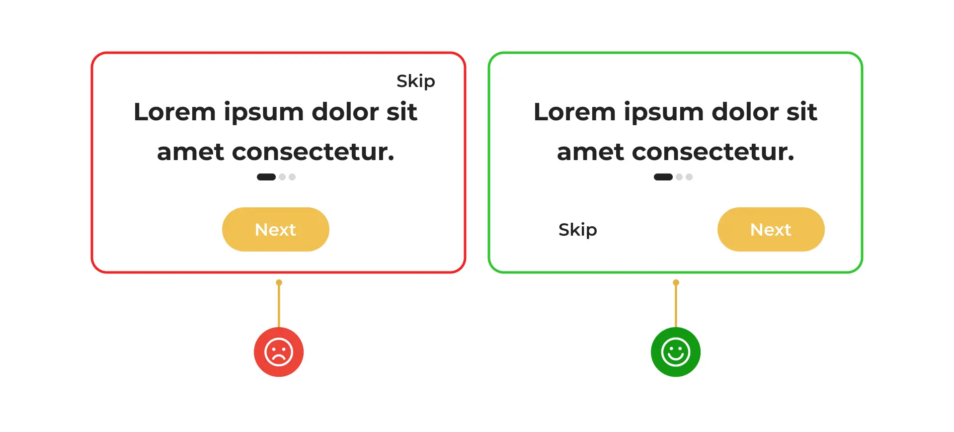
Adding a skip option during onboarding is a best practice in user experience design. Onboarding refers to the process of introducing new users to a product or service and helping them get started. While onboarding can be helpful for some users, others may prefer to skip it and start using the product or service immediately.
By adding a skip option during onboarding, users have the choice to skip the process if they wish. This can help reduce frustration and improve the user experience, as users are not forced to complete a process that they may find unnecessary or time-consuming. Additionally, offering a skip option can help increase user engagement and retention, as users are more likely to continue using the product or service if they have a positive experience.
When designing the skip option, it is important to keep it in the “thumb zone” area. The thumb zone refers to the area of the screen that is easily accessible with the thumb when holding a mobile device with one hand. By keeping the skip option in the thumb zone, users can easily access it without having to use both hands or adjust their grip on the device. This can help reduce friction and make the skip option more convenient for users.
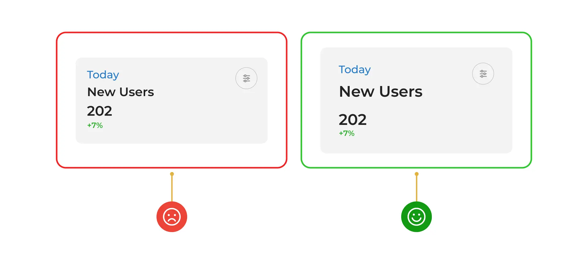
Use contrast instead of a thematic break
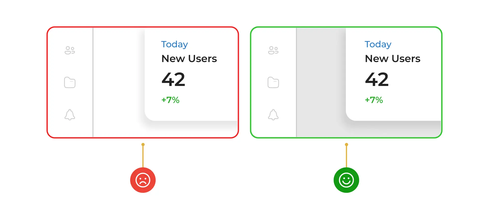
Using contrast instead of a thematic break is a design technique that can help improve the visual hierarchy and readability of a design. A thematic break is a visual element that separates different sections or content on a page, such as a line or a divider. While thematic breaks can be effective in some cases, they can also create visual clutter and distract from the content.
By using contrast instead of a thematic break, designers can create a clear visual hierarchy that guides the user’s eye and makes the content easier to read. Contrast refers to the difference between two elements, such as color, size, or shape. By using contrasting elements, designers can create a clear separation between different sections or content on a page without the need for a thematic break.
For example, using a different color or font size for headings can create contrast and visually separate them from the body text. Similarly, using a different background color or texture for different sections can create contrast and visually separate them from each other. By using contrast instead of a thematic break, designers can create a more cohesive and visually appealing design that enhances the user experience.
Line-height should be 140% of the font-size
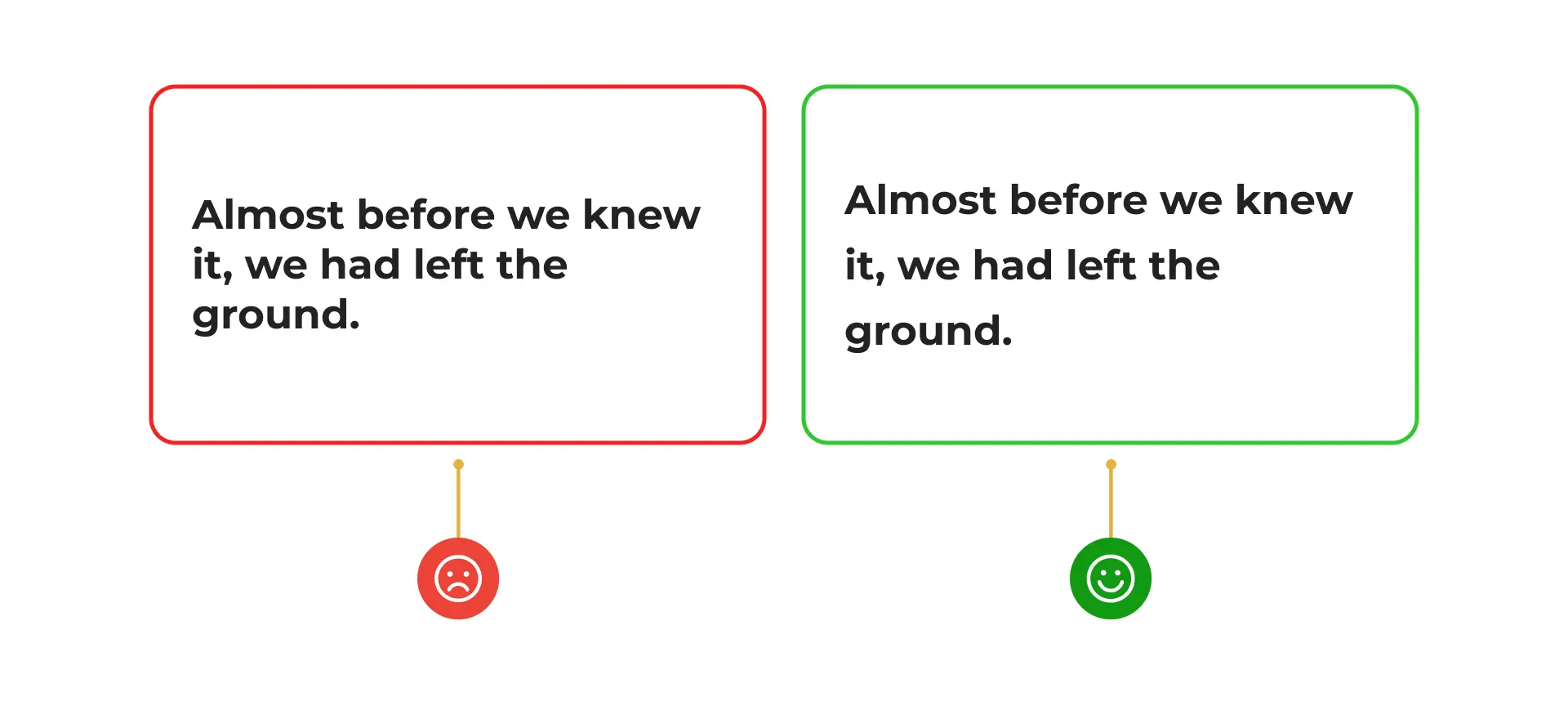
Keeping the line-height at 140% of the font-size being used is a design principle that can help improve the readability and legibility of text. Line-height refers to the vertical space between lines of text, while font-size refers to the size of the text. By keeping the line-height at 140% of the font-size, designers can create a comfortable and easy-to-read text block.
When the line-height is too small, the text can feel cramped and difficult to read. This can cause eye strain and fatigue, especially when reading for an extended period. On the other hand, when the line-height is too large, the text can feel disjointed and difficult to follow. By keeping the line-height at 140% of the font-size, designers can create a balanced and comfortable reading experience that is easy on the eyes.
It is important to note that the optimal line-height may vary depending on the font and the design context. For example, a serif font may require a larger line-height than a sans-serif font. Similarly, a design with a lot of white space may require a smaller line-height than a design with a lot of text. However, as a general rule, keeping the line-height at 140% of the font-size is a good starting point for creating a comfortable and legible text block.
Do not uppercase for buttons

Using all caps in buttons is a design practice that should be avoided as it can make the text difficult to read, especially for longer texts. All caps refers to text that is written entirely in capital letters. While all caps can be effective in some cases, such as for short headlines or titles, it can be challenging to read when used for longer texts.
One of the main issues with using all caps in buttons is that it can reduce legibility. When text is written in all caps, it can be harder to distinguish between individual letters and words. This is because all the letters have the same height and shape, which can make it difficult for the eyes to scan the text. Additionally, all caps can create a visual imbalance, as the text appears to be shouting or emphasizing every word.
Instead of using all caps, designers can use a combination of uppercase and lowercase letters to create a more balanced and legible text. By using uppercase letters only for the first letter of each word or for important words, designers can create a clear visual hierarchy and make the text easier to read. Additionally, designers can use other design elements, such as color, font size, and contrast, to create emphasis and draw attention to the button.
Use white space generously
Using white space generously is a design principle that can help improve the readability and visual appeal of a design. White space, also known as negative space, refers to the empty space between design elements. By using white space effectively, designers can create a sense of balance and harmony in the design, as well as guide the user’s eye to the most important elements.
However, it is important to use white space without breaking the law of proximity. The law of proximity states that objects that are close together are perceived as a group, while objects that are far apart are perceived as separate. This means that when designing a layout, designers should group related elements together and separate unrelated elements with enough white space. By following the law of proximity, designers can create a clear and organized visual hierarchy that makes it easier for users to understand the content.
Create a bounding box for icon buttons
Creating a bounding box for icon buttons is a design practice that can help improve the usability and accessibility of a design. A bounding box is a rectangular box that surrounds an icon or button, providing a clear and consistent target area for users to click or tap on. By creating a bounding box for icon buttons, designers can ensure that users can easily interact with the button, regardless of the size of their device or their level of dexterity.
The minimum height for a bounding box for icon buttons is typically 44px. This is because 44px is the minimum recommended size for touch targets on mobile devices, according to Apple’s Human Interface Guidelines. By following this guideline, designers can ensure that the button is large enough to be easily tapped on a mobile device, even for users with larger fingers or limited dexterity.
It is important to note, however, that the optimal size for a bounding box may vary depending on the design context. For example, if the button is located in a crowded or complex design, it may need to be larger to ensure that users can easily find and interact with it. Similarly, if the button is located in a design with a lot of white space, it may be able to be smaller without sacrificing usability.
Conclusion
It’s easy to get caught up in the latest design trends and overlook the basics, but by taking the time to implement these tips and tricks, designers can create designs that stand the test of time and provide a great user experience.
With a little attention to detail and a focus on the fundamentals, you can create designs that users will love and that will help your business succeed. In conclusion, designing a user interface and user experience that is both visually appealing and user-friendly requires attention to detail and a focus on the fundamentals.
If you’re looking for professional UI-UX services to take your designs to the next level, look no further than 42Works. Our team of experienced designers can help you implement these tips and tricks and create designs that are both visually stunning and user-friendly. To learn more, email us at contact@42works.net.