It is baffling to see the number of people who have no idea about the importance of typography. Since the dawn of written language, artistic individuals have found the art in different forms of written scripts.
Over the years, first with the coming of the typewriter and then with the subsequent invention of the computer, typing as become something more than just words. It has turned into the backbone of the graphic design services industry.
This is why typography has become a creative outlet for many brands looking to successfully communicate their message and brand identity. Thus making typography into one of the intrinsic facets of user interface design.
Choose your typeface wisely
A typeface is a collective graphical representation of printable text characters that include different fonts, weight, size, point color or design. Comic Sans is a good example of a typeface. Meanwhile, LDFComicSans is a font which is part of the Comic Sans typeface family.
Majority of the typefaces can be categorized into four principal groups that comprise of;
Serifs
Serif is the oldest typeface among all the other forms. The small decorative strokes called “Feets” that extend themselves from the tip of the text characters are what differentiates Srief from the other fonts. ‘Feets’ are universal within this font family.
Sans-Serifs
Sans-Serif typeface is a relatively modern form. Therefore Sans-Serif lacks small and intricate stokes or feet at the end of the letters. This enables them to be better suited to be read off of small screens, i.e – smartphones. Arial, Roboto, Poppins, etc. are common examples of this typeface.
Decorative
Decorative typefaces came into the limelight during the 19th Century, where they were mostly used for posters advertisements. Decorative primary objective is to serve as an ornamental display font that is beautiful. Decorative fonts easily catch the attention of the readers, as their old-school typographic makes them seem fancy. Arcadia, Caveat, Lobster would be common examples.
Scripts
The script font is essentially the fluidity of stokes made by handwriting, traditionally done for displays or trade printings. Script is a font mostly used to convey an emotion. This is why graphic design services providers widely use this font for invitations, greeting cards, expressive texts, etc. To better understand typography we need to dive deep into the script font.
Understanding Scripts
The widespread usage of Scripts is what makes it an inseparable part of decoding the true potential of typography. We shall look into the two different types of Scripts in a bid to better understand them.
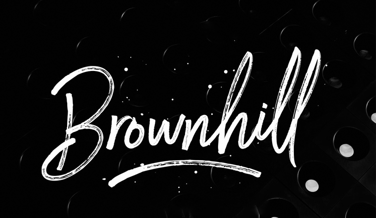
- Formal Scripts – They interconnect with each other in a fluid motion. They have a certain grace about them, that makes them perfect for; ‘invitations, greeting cards, etc.’ It is their aesthetically pleasing look when first read, which makes them so attractive to the reader.
- Casual Scripts – Comparative to formal scripts, casual scripts are essentially created to look friendly, welcoming and engaging. Their strokes even though interconnected, aren’t necessarily heavy to read. They convey a touch of warmth, relaxation, and warmth.
Kerning Done Right
Occasionally a font’s default spacing might not be ideal for a certain type of character combination you are looking for.
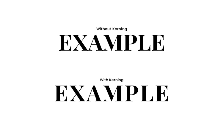
Kerning is the visual exercise of adjusting the spacing between different elements in a font to fit a certain design narrative. It is not the actual space between characters, but the visual perception that matters in kerning. Rather than mathematically creating equal spacing between characters.
Leading is a must
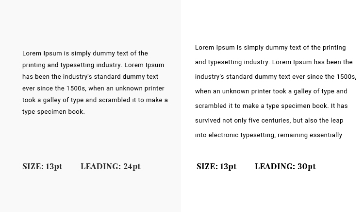
Good leading helps the reader easily consume the information provided to them. Leading is what makes going from one text line to another, coherent and legible. It is standard in good leading practices to keep the point size at 120% to adjust to any font peculiarities.
Conclusion
It is quintessential for modern-day businesses to understand the inner-workings of UI design. Not only does it help them increase their achieve their business goals. It also equips them with the know-how to select the best graphic design services providers out there.