When designing a website, the search bar design is often an afterthought. However, it is a powerful conversion optimization tool and a significant revenue driver, especially for e-commerce sites. A Forrester report reveals that 43% of site visitors go straight to the search box, and these users, often referred to as ‘spearfishers’ (those searching for a specific product), are twice as likely to convert.
Here’s why a well-designed search box is crucial for a successful e-commerce website and five proven tips to design the perfect search bar to enhance the shopper experience, along with some inspirational examples.
Best Practices for Search Bar Design
A well-designed search bar is crucial for enhancing user experience and driving conversions. Let’s explore key strategies to optimize your search bar’s effectiveness.
Enhancing Search Bar Design Visibility and Usability
The placement and size of your search bar significantly impact its discoverability. An eConsultancy study found that users who use the search feature convert at 4.63%, compared to the website average of 2.77%, making it 1.8 times more effective. To optimize its effectiveness:
- Prioritize placement: Avoid burying the search bar in drop-down menus. Instead, position it prominently where shoppers instinctively look, often at the top of the page.
- Create contrast: Ensure the search bar stands out from the overall website design using contrasting colors.
- Size matters: The search bar should be large and easily noticeable. Its size should complement other header elements while providing ample space for user input.
- Strategic positioning: Place the search bar at the top of the page, either centered or in the top-right corner. Research indicates these locations are most preferred by users.
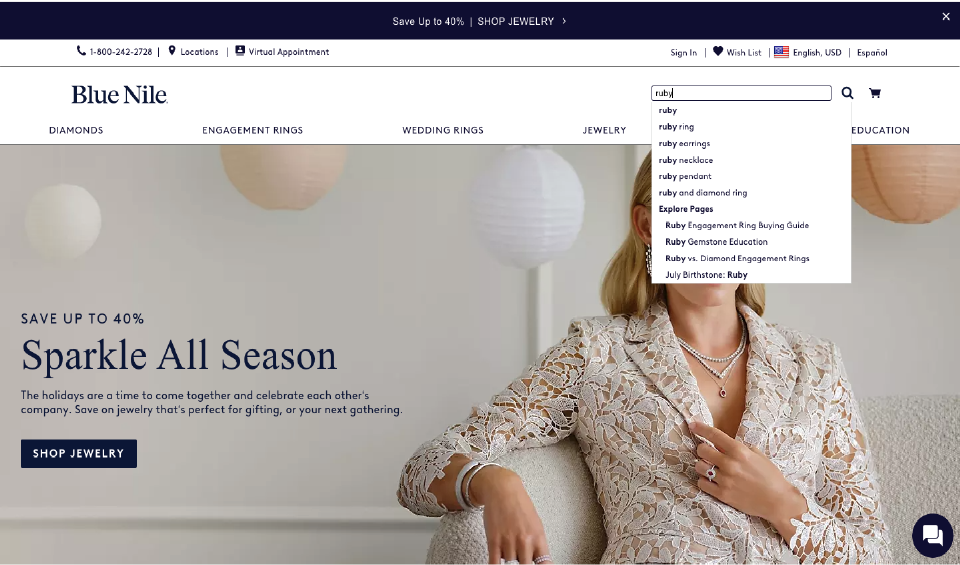
Maintain accessibility: Like Blue Nile, keep the search bar visible even after a query is entered. Offer autocomplete suggestions and clear search results.

The search bar consists of a text input field and a search button. Determine the optimal text field length based on average query length. Consider expandable search bars for longer queries, similar to Madewell’s design.

Continuously test different search bar placements, sizes, and designs to refine the user experience. Employ A/B testing to gather data and make informed decisions.
Ready to optimize your search bar? Our UX experts at 42Works can help.
Leveraging Autosuggest for Improved Search
Shoppers often have a general idea of their desired product but may struggle with exact terms or spelling. Autosuggest offers valuable assistance by predicting search queries and reducing errors. This feature can boost sales by a substantial 24%.
To maximize autosuggest effectiveness:
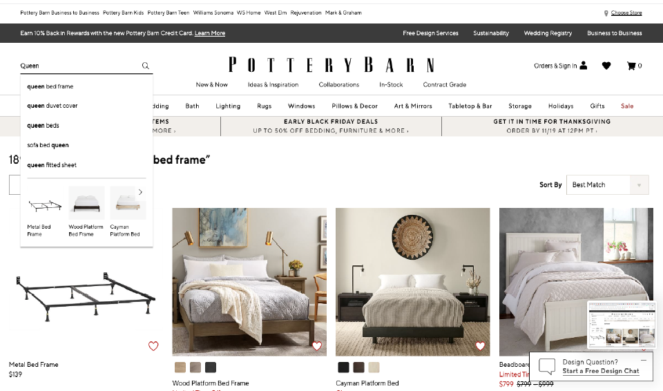
- Limit suggestions: Display a concise list of relevant suggestions.
- Highlight user input: Bold the portion of the query entered by the user.
Showcase popular products: Include links to popular products within the suggestions to decrease bounce rates.

PotterBarn exemplifies effective autosuggest implementation by incorporating these elements.
Refining Search Results with Filtering Options
The search results page plays a crucial role in converting shoppers into customers. Enhance usability by offering robust filtering options.

Clothing retailer MatchesFashion effectively demonstrates how filtering by type, brand, color, and price can help shoppers narrow down choices. Clearly displaying product details, including brand, name, and price, further informs and entices customers.
Optimizing Search for Mobile
With over 50% of online shopping occurring on mobile devices, a mobile-optimized search bar is essential. Beyond functionality, make the search bar highly visible and accessible within the limited screen space.
Given that 43% of retail website users go directly to the search bar, optimization is crucial for conversions. Follow these mobile search bar best practices:
- Clear visibility: Ensure the search bar and button are easily seen and selectable. Consider using a magnifying glass icon to reveal the search bar when clicked.
- Sufficient space: Provide adequate inactive space around touch targets for accurate input.
- Autocomplete integration: Implement autocomplete suggestions for mobile users.
Need a mobile-friendly search bar that delivers results? 42Works can help.
Continuous Testing and Improvement
Enhancing search bar performance is an ongoing process. A/B testing is essential for identifying and implementing improvements. Continuously analyze user behavior and refine your search functionality accordingly.
Ready to Boost Your Conversions?
Implement these best practices and transform your e-commerce website’s search experience. By following these guidelines, you can ensure your search bar helps users find what they’re looking for with minimal effort, driving conversions and revenue for your e-commerce business.
At 42Works, our expert website UI/UX designers specialize in designing search bars that improve shopper experiences and drive conversions. Enhance your search functionality and watch your revenue soar. With 42Works, you can ensure your search bar is both visually appealing and highly functional.
Contact us today for a free consultation.
FAQs
Q: Where should I place the search bar on my website?
A: The most effective placement for a search bar is typically at the top of the page, either centered or in the top-right corner. This is where users instinctively look.
Q: How can I improve search bar visibility?
A: Use contrasting colors to make your search bar stand out from the rest of your website. Ensure it’s large enough to be easily noticed.
Q: What is the ideal size for a search bar?
A: The size of your search bar should complement the other elements in your header. The text field should be long enough to accommodate most search queries.
Q: What is autosuggest and why is it important?
A: Autosuggest is a feature that predicts search queries based on user input. It helps users find products faster and reduces errors.
Q: How can I improve search results?
A: Offer filtering options on your search results page to help users refine their search. Clearly display product information, including brand, name, and price.
Q: How do I optimize my search bar for mobile?
A: Ensure your mobile search bar is easily visible and accessible. Use clear touch targets and consider using a magnifying glass icon to reveal the search bar.
Q: Should I use autocomplete on mobile?
A: Yes, autocomplete is highly recommended for mobile search to improve user experience and speed up searches.
Q: How can I test the effectiveness of my search bar?
A: Use A/B testing to compare different search bar designs, placements, and features. Track user behavior and conversion rates to measure success.
Q: How often should I test my search bar?
A: Continuously testing and refining your search bar is essential for optimal performance. Consider testing new features or designs regularly.


