To ensure you are constantly improving your UI game by creating the best, most beautiful, and accessible UIs, it is important to stay up-to-date with the latest design trends, keep an eye on emerging technologies, and incorporate them into your designs.
Additionally, regular feedback from your users, conducting usability testing, and collaborating with other designers and developers to share knowledge can help you stay ahead of the curve and create truly innovative and engaging user experiences.
To add to the above, there are also some easy yet popular and evergreen UI & UX micro-tips that can help you in improving your designs and the user experience. Let’s jump directly into it.
Creating a Dark-theme Design? Make sure to soften up the whites as well.
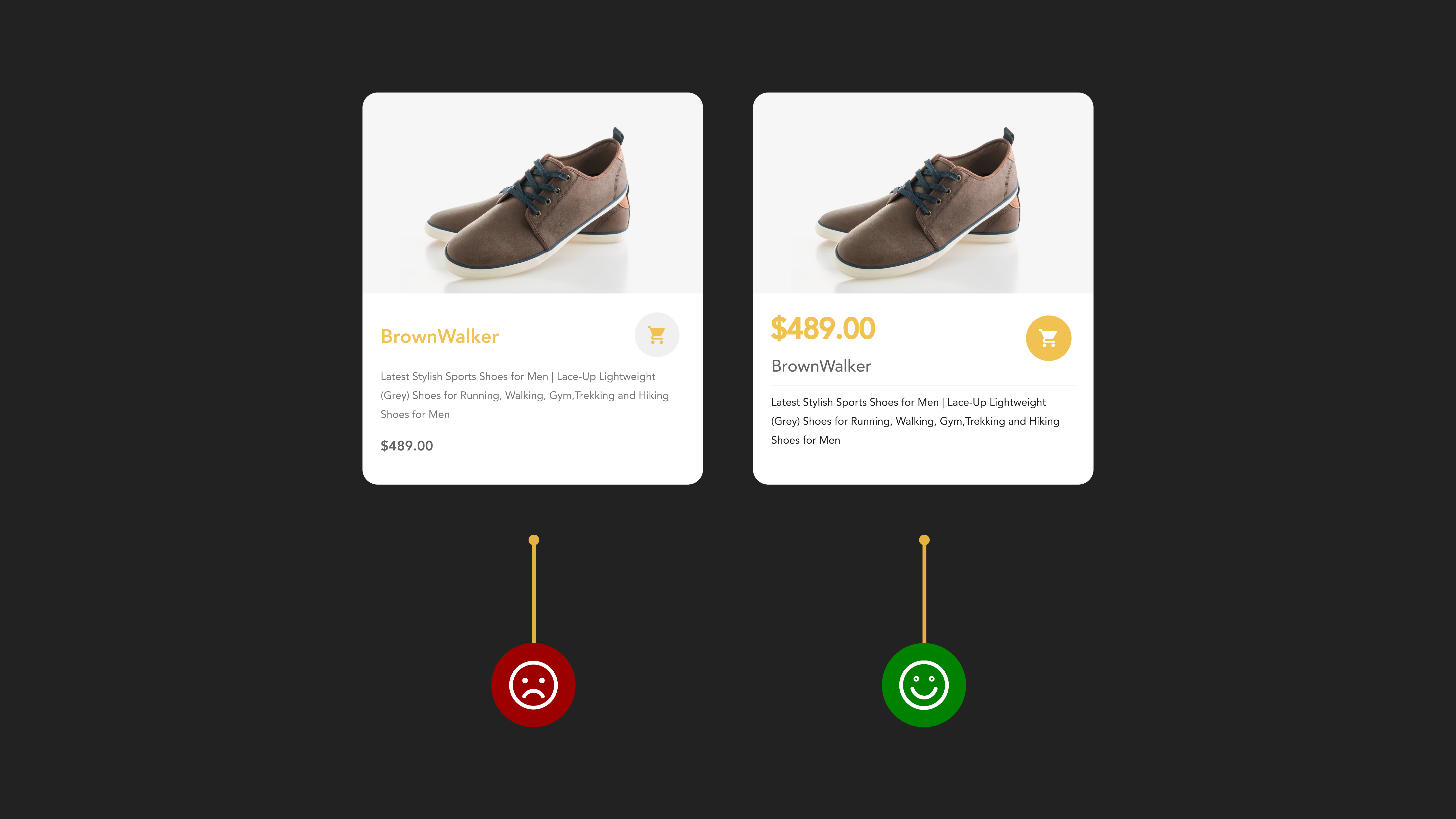
If you are working on a dark-themed design, opting for pure black can be a poor choice as it can affect usability for many users. Therefore, soften up black with some white wherever you can.
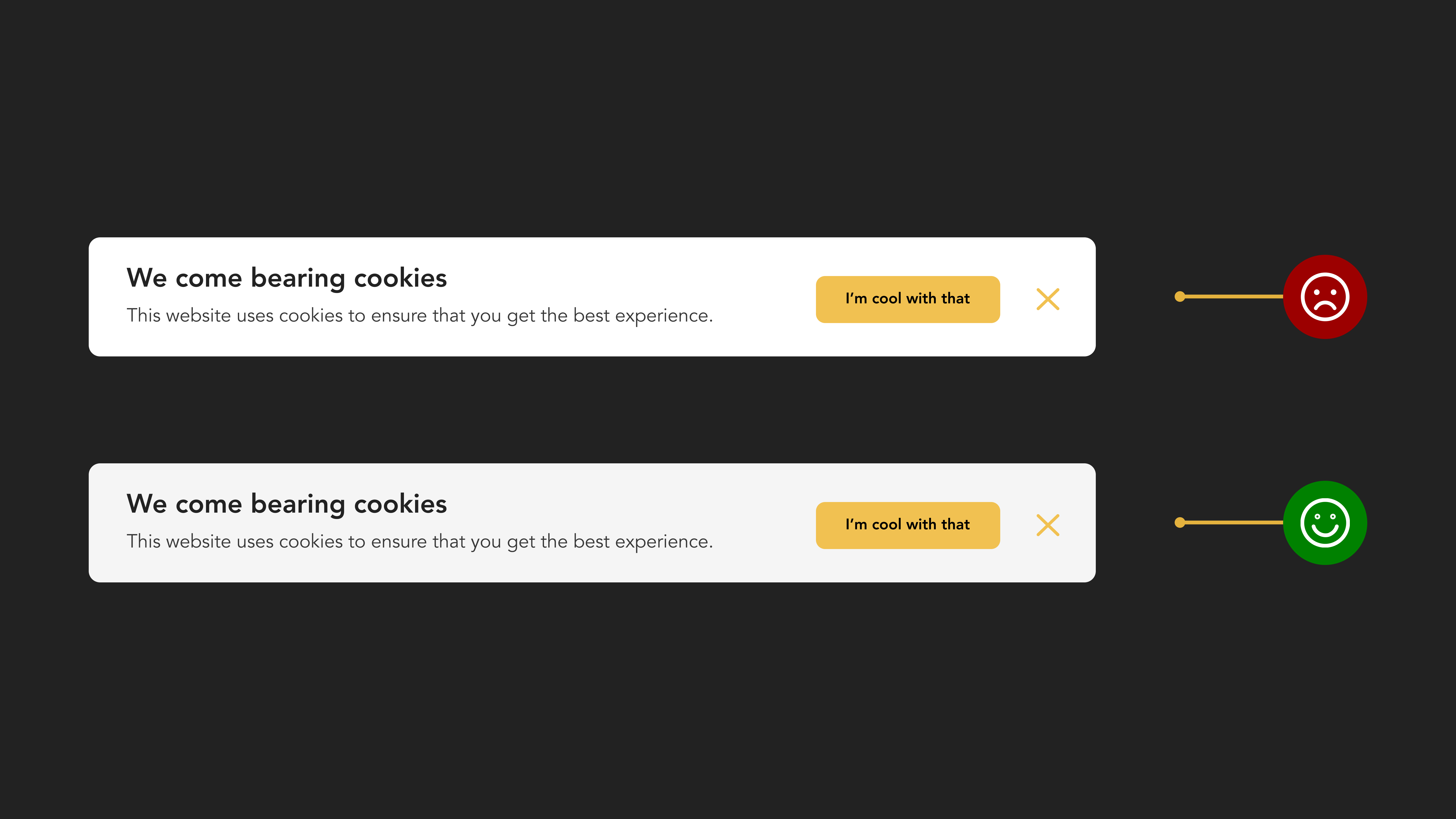
The same thing applies if you are having a design with a white theme and overusing white. It can create a jarring effect when placed alongside dark-themed elements, ultimately resulting in an unsatisfactory visual experience.
To make the design more user-friendly and visually appealing, consider reducing the contrast of the white elements and making them less harsh on the eyes.
Avoid relying solely on color to convey error states on your forms.
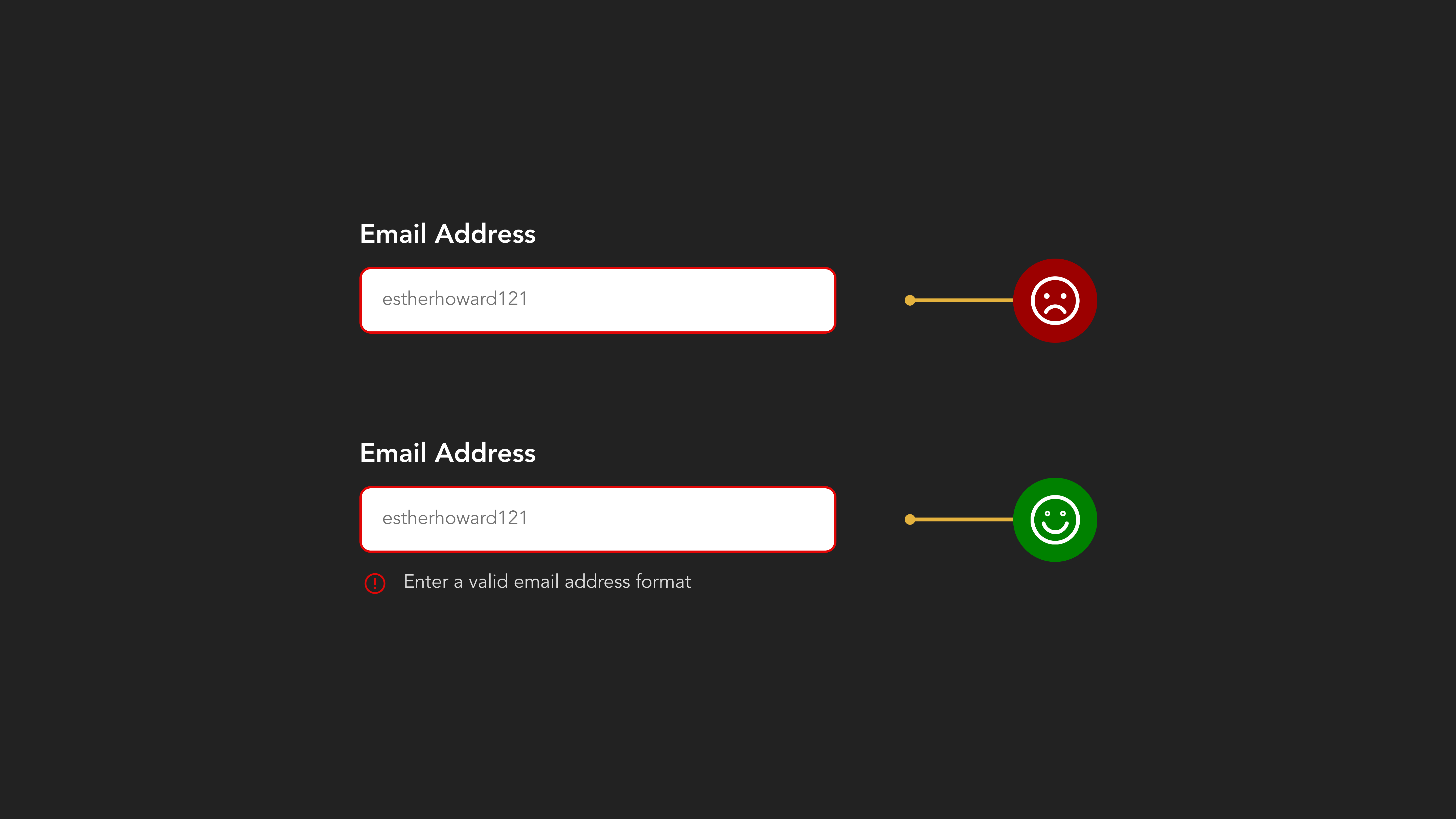
When it comes to accessibility on your forms, one must not rely on color alone when communicating error states to the users. For instance, if you are communicating an error state with color alone, someone with color blindness won’t be able to see it. And, that’s something you don’t want. Trust us on this.
Therefore, use a combination of colors, icons, and some error messages to provide accessibility to your users and not leave them confused with the issue being communicated to them.
Make your selected items stand out that catch the user’s eye.
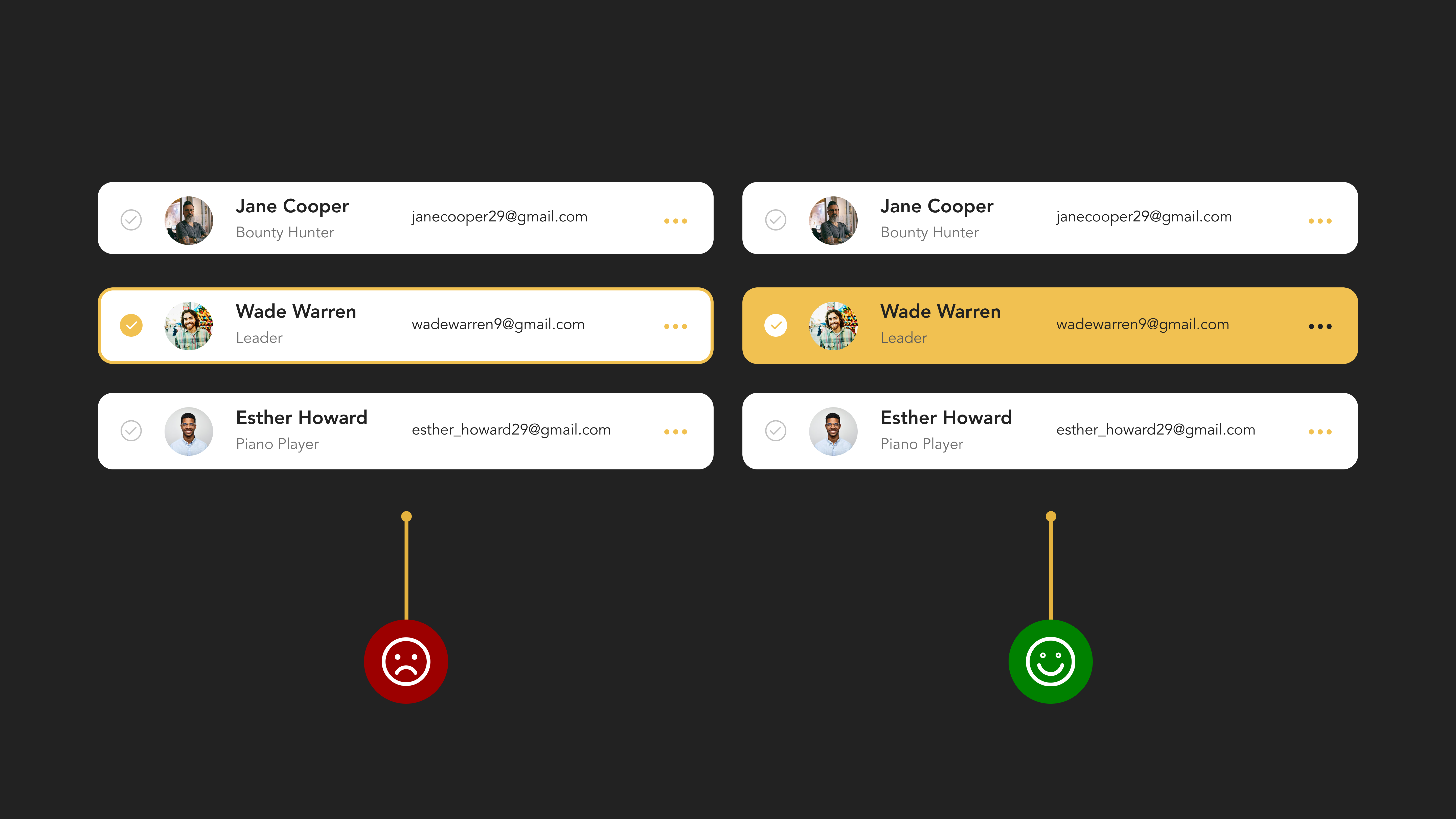
You can make your UIs clean, stripped back, and straightforward but, not at the cost of a neglected user experience. For instance, you need to ensure that all your selected items on the screen are easily identified by users at first glance.
You don’t have to do much here, be simple yet bold and let your users easily differentiate between which item they have selected and that their input has been recognized.
Consider darkening your text if you are using a lighter font weight.
Using shades like gray when putting up long content on websites is something everybody doing out there. It’s good and all, only if you don’t settle for using a lighter font size and color, and affect users’ eyesight on all screen sizes of yours.
You cannot compromise on your users with poor vision or else they will look for the back button and exit your site in no time. Instead, if you have used or are planning to use light text, fix this issue by darkening it and making it more accessible to everyone.
Provide clear information without having your users second-guessing the next step.
When it comes to user conversions, it’s simple math. Leaving your customers uncertain about the outcome of clicking a CTA will result in a lack of clicks altogether. This means that users are unlikely to click on a CTA button unless they have a clear understanding of what will happen next. Therefore, ensure they are aware of each step they encounter rather than be left in the dark.

It’s important to keep your users well informed before they take action on your website or application so they can expect the outcome of clicking on that attractive CTA element of yours.
Simply, don’t leave your users uninformed about what happens next on your website. Everything up there is for them so let them know in the easiest way possible.
Give Priority To The Most Important Elements
Every user’s eyes should be drawn to your screen’s most important elements as quickly as possible, efficiently, and with a minimum effort every time.
How? Use visual hierarchy principles like font size, weight, color, and layout. This is the easiest and probably the most important way in which you can prioritize essential elements on your screen.
Moreover, by following these principles, your user experience will improve to a great extent as well as lead them to your products (or services) in a more streamlined manner.
Conclusion
UI and UX Design is, most of the time, all about basics more than anything else. As explained in the above tips, one can easily see how simple it is to make small adjustments in your UI-UX designs and provide your users with a better experience. Not only them, but you, as a designer/developer/product owner, are also making it easier for yourself.
When planning your design, keep these tips in mind for productive results. If you require assistance, the UI & UX experts at 42Works are available to provide the best digital solutions to their clients.
Explore 42Works’ UI & UX services, get more UI & UX tips and articles, or get in touch with us to collaborate on creating beautiful designs.