Just like the clothes you wear, the design of your web page says a lot about you. Is your web page the equivalent of a custom tailored suit and a pocket square? Or is it more like a pair of rugged denims and a gravy-stained sweatshirt? Believe me, your visitors will notice even if you don’t.
Here’s my take on 11 mistakes you surely need to avoid while designing a website.
1. Music/Video Autoplay
A classical music lover is not going to enjoy a hard rock music, nor will a heavy metal fan get much enjoyment from your classical track. So, don’t play music or a video, unless it’s mandatory.
Let the user push the “Play” button as opposed to jamming the music on his face right after he/she enters the website.
2. Animation Misuse
Having some movement on your web page can be an effective way to draw attention to certain elements and to simply pep things up a bit. But too many scrolling texts, and cramming in more information through animations — it gets on the user’s’ nerves and make it hard to spot the site’s information amidst all the wiggling. Offer alternatives or may be a skip button, if it’s a full page animation.
3. Unscrupulous Redirects

Secondary windows can be put to good use if they are under the user’s control. For example, displaying an image in a secondary window when the user clicks a link is a good approach. But automatic display of secondary windows, with no control by the user, make people cry. Don’t do it! Also, many people run software that blocks these windows, or popups, from appearing, so your message may be lost.
4. Slow Loading

Back in the day, before we became an internet generation, people would wait for days or even weeks for an order to be delivered. Asking them now to hang on for ten or twenty seconds while your pages appear seems like a lifetime. If your site is loading significantly slow, put it on a diet — reduce image size or special add-ons.
5. Unfavourable Backgrounds
Implementing a “busy” background or background with a color similar to the text color make reading a pain. Just because blue text on a green background looks great to you doesn’t mean that everyone else will be able to read it easily. Make good use of background images, respecting visual hierarchy and also content information.
6. Annoying Ads and pop-ups
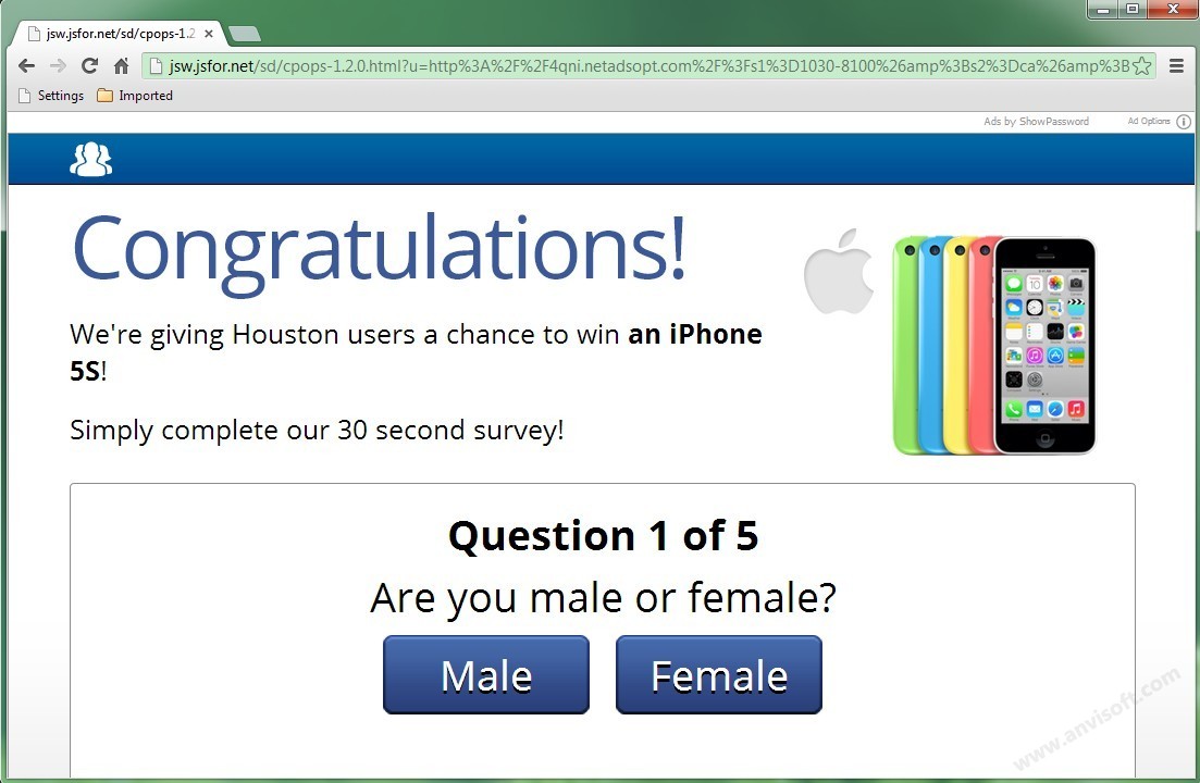
Interruptive website elements like Ads, pop-ups interfere with what users want to consume. Use targeted advertising, if you want. It’s more relevant and less obtrusive. For example, if your page is about cooking, your banner will be displayed only on other pages related to cooking, and only ads for other cooking sites will be displayed on your page.
7. No Back To Top Link

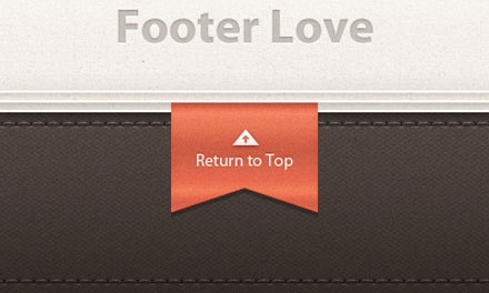
Users don’t think to hit the Home key and it can be annoying scrolling all the way back up. So, if your website publishes very long pages of content then back to top link is a must-have element in your layout.
8. Clumsy Content
Speak like a human, not a corporation. Being too clever leads to confusion. Being clear leads to credibility, conversation and conversion. In this attention-scarce economy, buyers expect to receive informative element that’s tailored to their specific wants.So,
- Keep your content as brief as possible
- Provide description with the help of pictures
- Distinguish content with – bullets, tables, bold and italics, and
- Keep it updated
9. Bad Choice Of Colors

The wrong choice of colors is an exit ticket from your website.
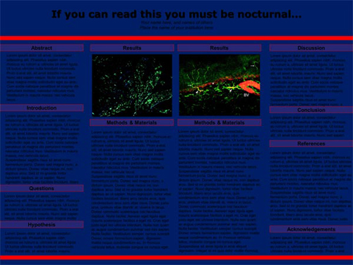
A dark copy on dark tinted backgrounds, a series of clashing bold shades, or an explosion of too many colors bright colors — sucks. Design the color palette around your objectives (i.e. deliver a mood, let the user focus on the content, etc.).
10. Ignoring Mobile
According to a research, a whopping 60% of internet traffic comes from mobile devices now. So if you don’t have a mobile friendly website, that’s a lot of users that cannot view your site, and a lot of potential customers that you can say goodbye to!
The best websites are those which can be easily browsed through on smart phones.
11. Bumpy Navigation
How frustrating is it when you visit a site looking for a specific piece of info or data , only to have to fight your way through a seemingly endless procession of links? Navigation needs to be seamless. Remember, inability to find what they want forces visitors to leave.immediately. Also, make sure the names you use for your links are clear and unambiguous.
Create a website that harnesses context plus content and puts your visitor at the core, you’ll experience an increase in traffic, leads, and word-of-mouth. Go ahead. Give it a shot.


